import matplotlib.pyplot as plt
import numpy as np
x = np.linspace(0, 10, 100)
y = np.sin(x)
plt.plot(x, y)
plt.xlabel("x")
plt.ylabel("sin(x)")
plt.title("Sine Wave")
plt.show()
2025-02-09
Matplotlib is a comprehensive library for creating static, interactive, and animated visualizations in Python. It provides a versatile and powerful set of tools for generating a wide range of plots, including line plots, scatter plots, bar charts, histograms, and much more. Matplotlib’s flexibility allows for customization of every aspect of a plot, from individual data points to overall layout and style. It’s built upon NumPy and is often used in conjunction with other data science libraries like Pandas and SciPy. While it offers a simple interface for common plotting tasks, it also provides extensive control for creating publication-quality figures and complex visualizations.
The easiest way to install Matplotlib is using pip, Python’s package installer:
pip install matplotlibThis command will download and install Matplotlib along with its dependencies. For advanced installation options (such as installing specific versions or from source), refer to the official Matplotlib documentation. If you encounter issues, ensure you have a compatible version of Python and necessary build tools installed (like compilers for your operating system). After successful installation, you can verify it by running a simple Python script:
import matplotlib
print(matplotlib.__version__)
This will print the installed Matplotlib version.
The standard way to import Matplotlib is:
import matplotlib.pyplot as pltThis imports the pyplot module, which provides a convenient interface for creating plots. A simple line plot can be created as follows:
import matplotlib.pyplot as plt
import numpy as np

x = np.linspace(0, 10, 100)
y = np.sin(x)

plt.plot(x, y)
plt.xlabel("x")
plt.ylabel("sin(x)")
plt.title("Sine Wave")
plt.show()
This code generates a plot of a sine wave, adding labels and a title. plt.show() displays the plot. Note the use of NumPy for generating the data.
Understanding the fundamental concepts of Figures, Axes, and Artists is crucial for effectively using Matplotlib.
Figure: The top-level container for all plot elements. It’s the overall window or page where the plot is displayed. Think of it as the canvas.
Axes: An individual plot within a Figure. A single Figure can contain multiple Axes, allowing for subplots or multiple plots within the same figure. It’s where the data is plotted, along with axis labels, titles, and legends.
Artists: Every element within an Axes is an Artist: lines, text, images, etc. These are the individual components that make up the plot’s visual representation. The Axes manages these Artists and their positions.
The previous example implicitly creates a Figure and Axes. For more control, you can create them explicitly:
import matplotlib.pyplot as plt
import numpy as np

fig, ax = plt.subplots()  # Create a figure and an axes

x = np.linspace(0, 10, 100)
y = np.sin(x)

ax.plot(x, y)  # Plot on the Axes
ax.set_xlabel("x")
ax.set_ylabel("sin(x)")
ax.set_title("Sine Wave")

plt.show()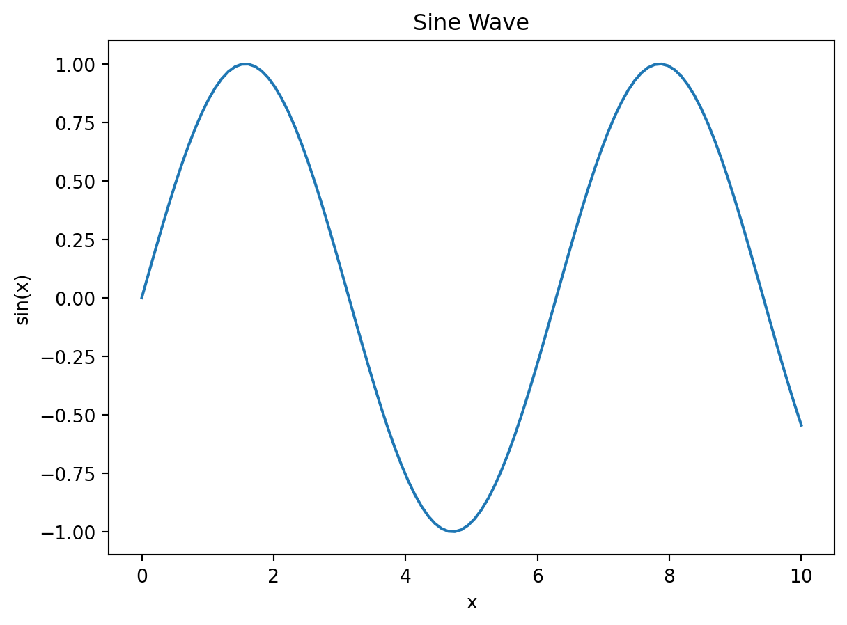
This code achieves the same result but demonstrates the explicit creation of a Figure and Axes, providing more control over the plotting process, especially when working with multiple subplots or more complex visualizations.
Line plots are used to visualize the relationship between two variables, typically showing trends or changes over time. They are created using the plot() function.
import matplotlib.pyplot as plt
import numpy as np

x = np.linspace(0, 10, 100)
y = np.sin(x)

plt.plot(x, y, label='sin(x)') #label for legend
plt.xlabel("x")
plt.ylabel("sin(x)")
plt.title("Line Plot")
plt.legend() #show legend
plt.grid(True) #add grid
plt.show()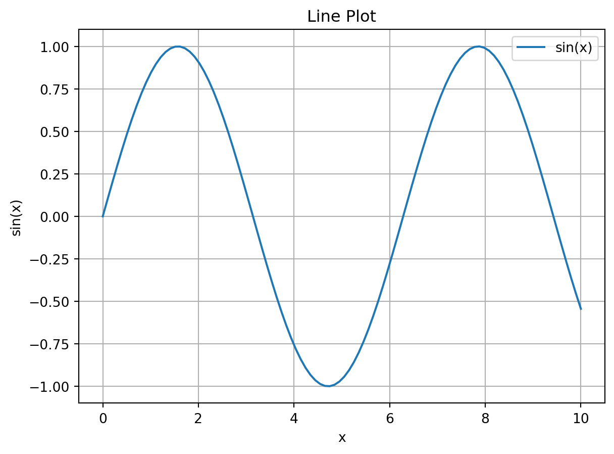
You can customize line style, color, marker, and linewidth using optional arguments to plot(). See the Matplotlib documentation for details on these options.
Scatter plots display the relationship between two variables as a collection of points. They are useful for identifying correlations and patterns. Use scatter() to create them.
import matplotlib.pyplot as plt
import numpy as np

x = np.random.rand(50)
y = np.random.rand(50)
sizes = np.random.randint(10, 100, 50)  # Varying point sizes
colors = np.random.rand(50)  # Varying point colors

plt.scatter(x, y, s=sizes, c=colors, alpha=0.7) #alpha for transparency
plt.xlabel("X")
plt.ylabel("Y")
plt.title("Scatter Plot")
plt.colorbar(label='Color Value') #add colorbar
plt.show()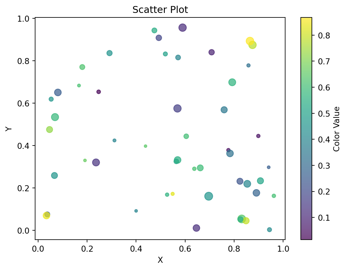
Customize point size, color, and transparency using the s, c, and alpha arguments respectively.
Bar charts are used to compare categorical data. bar() creates vertical bar charts, and barh() creates horizontal ones.
import matplotlib.pyplot as plt
import numpy as np

categories = ['A', 'B', 'C', 'D']
values = [25, 40, 15, 30]

plt.bar(categories, values, color=['red', 'green', 'blue', 'orange'])
plt.xlabel("Categories")
plt.ylabel("Values")
plt.title("Bar Chart")
plt.show()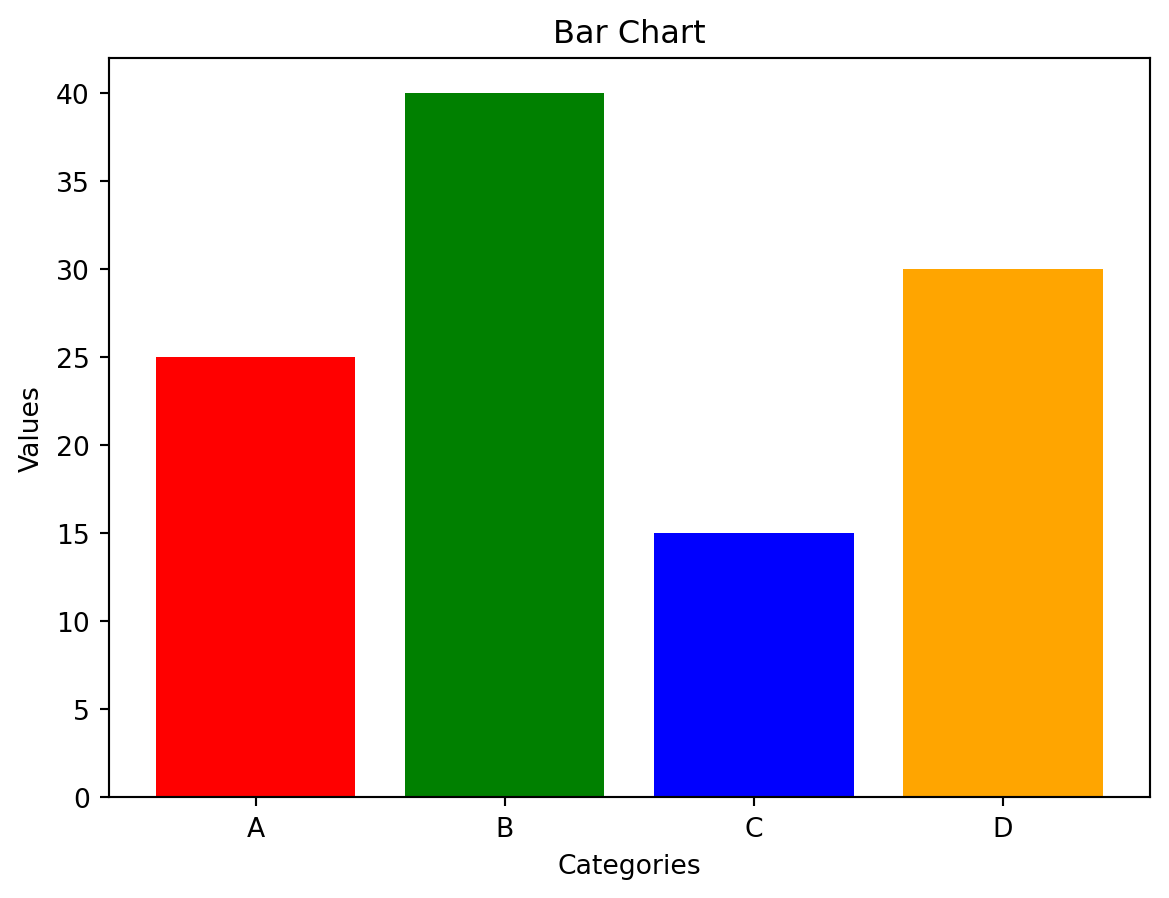
Histograms visualize the distribution of numerical data. hist() creates histograms.
import matplotlib.pyplot as plt
import numpy as np

data = np.random.randn(1000)
plt.hist(data, bins=30, color='skyblue', edgecolor='black') #bins control number of bars
plt.xlabel("Value")
plt.ylabel("Frequency")
plt.title("Histogram")
plt.show()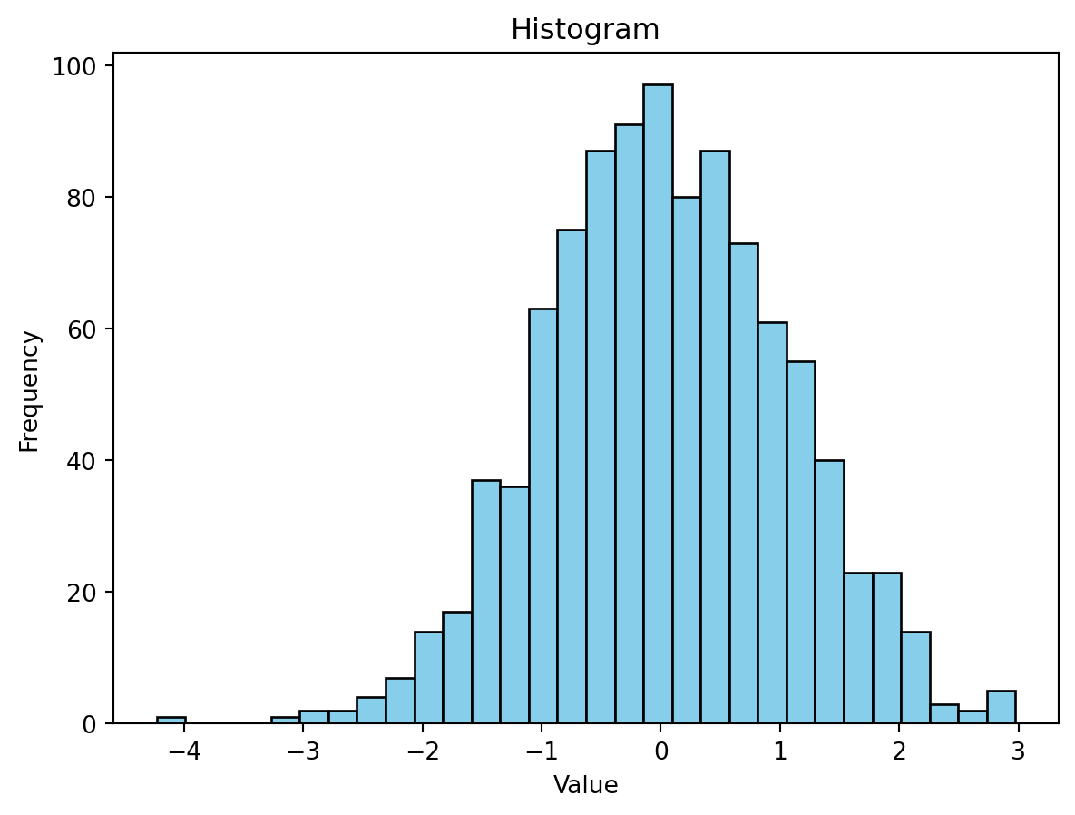
Pie charts show the proportion of each category within a whole. Use pie().
import matplotlib.pyplot as plt

labels = ['A', 'B', 'C', 'D']
sizes = [25, 30, 15, 30]
explode = (0.1, 0, 0, 0)  # Explode the first slice

plt.pie(sizes, explode=explode, labels=labels, autopct='%1.1f%%', shadow=True)
plt.title("Pie Chart")
plt.axis('equal')  # Equal aspect ratio ensures that pie is drawn as a circle.
plt.show()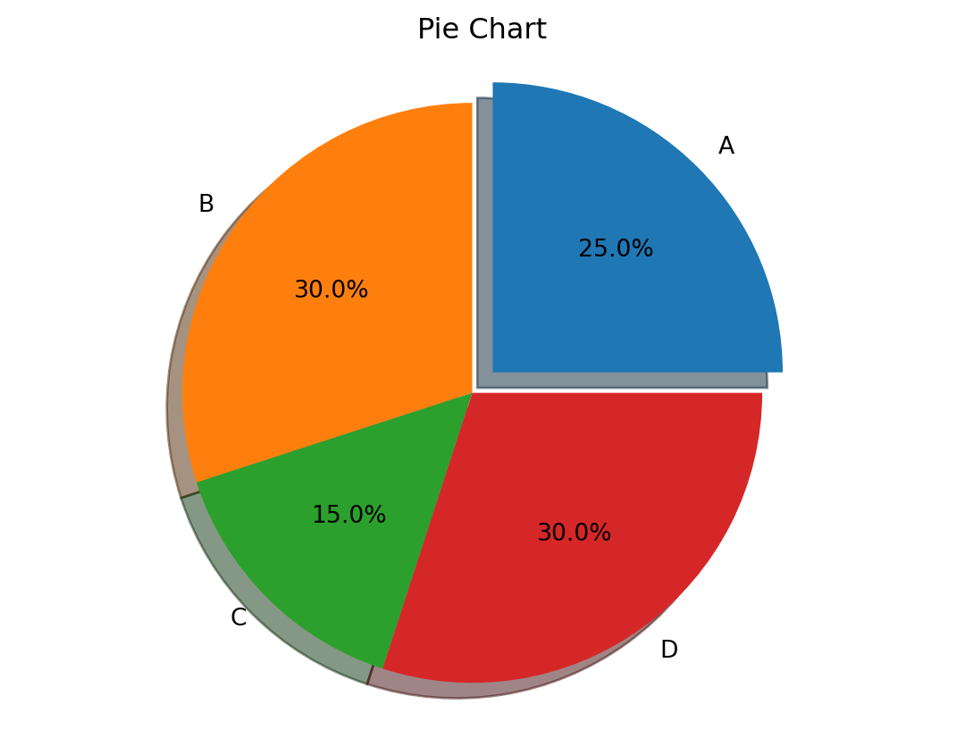
Box plots display the distribution of data using quartiles, median, and outliers. boxplot() generates box plots.
import matplotlib.pyplot as plt
import numpy as np

data = [np.random.normal(0, std, 100) for std in range(1, 4)]
plt.boxplot(data, labels=['Low', 'Medium', 'High'])
plt.ylabel("Values")
plt.title("Box Plot")
plt.show()
/tmp/ipykernel_2099803/2796181753.py:5: MatplotlibDeprecationWarning: The 'labels' parameter of boxplot() has been renamed 'tick_labels' since Matplotlib 3.9; support for the old name will be dropped in 3.11.
plt.boxplot(data, labels=['Low', 'Medium', 'High'])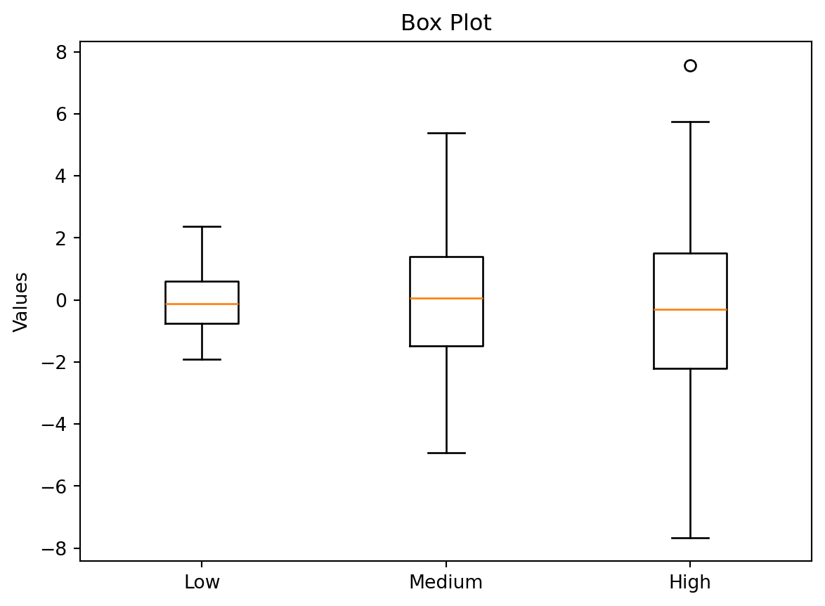
Errorbars show the uncertainty associated with data points. errorbar() adds error bars to plots.
import matplotlib.pyplot as plt
import numpy as np

x = np.arange(5)
y = [10, 12, 15, 14, 16]
errors = [1, 1.5, 0.8, 1.2, 1.8]

plt.errorbar(x, y, yerr=errors, fmt='o-', capsize=5)
plt.xlabel("X")
plt.ylabel("Y")
plt.title("Errorbars")
plt.show()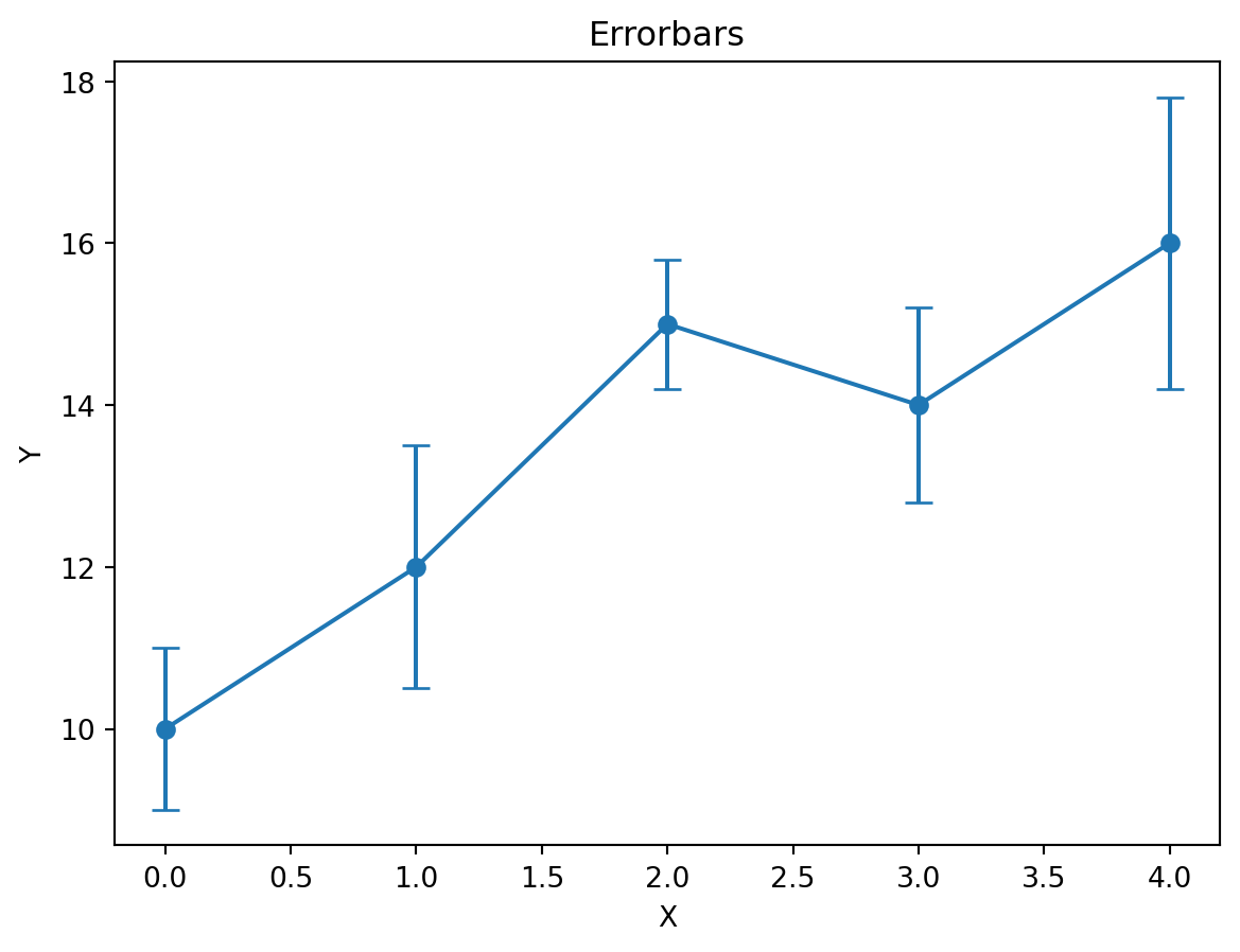
Matplotlib can display images using imshow().
import matplotlib.pyplot as plt
import matplotlib.image as mpimg

img = mpimg.imread('../../profile.jpg') #replace with your image path
plt.imshow(img)
plt.axis('off') #hide axis
plt.show()
Matplotlib’s mplot3d toolkit provides tools for creating 3D plots.
import matplotlib.pyplot as plt
import numpy as np
from mpl_toolkits.mplot3d import Axes3D

fig = plt.figure()
ax = fig.add_subplot(111, projection='3d')

x = np.arange(-5, 5, 0.25)
y = np.arange(-5, 5, 0.25)
X, Y = np.meshgrid(x, y)
R = np.sqrt(X**2 + Y**2)
Z = np.sin(R)

ax.plot_surface(X, Y, Z)
plt.show()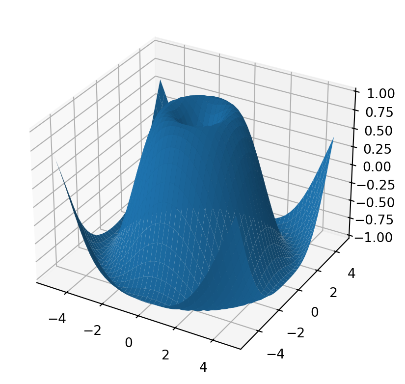
Remember to install the mpl_toolkits if necessary.
Creating multiple plots within a single figure uses subplots().
import matplotlib.pyplot as plt
import numpy as np

fig, axes = plt.subplots(2, 2, figsize=(8, 6))  # 2x2 grid of subplots

axes[0, 0].plot(np.random.randn(100))
axes[0, 1].hist(np.random.randn(100))
axes[1, 0].scatter(np.random.randn(100), np.random.randn(100))
axes[1, 1].imshow(np.random.rand(20, 20))

plt.tight_layout() #adjust spacing between subplots
plt.show()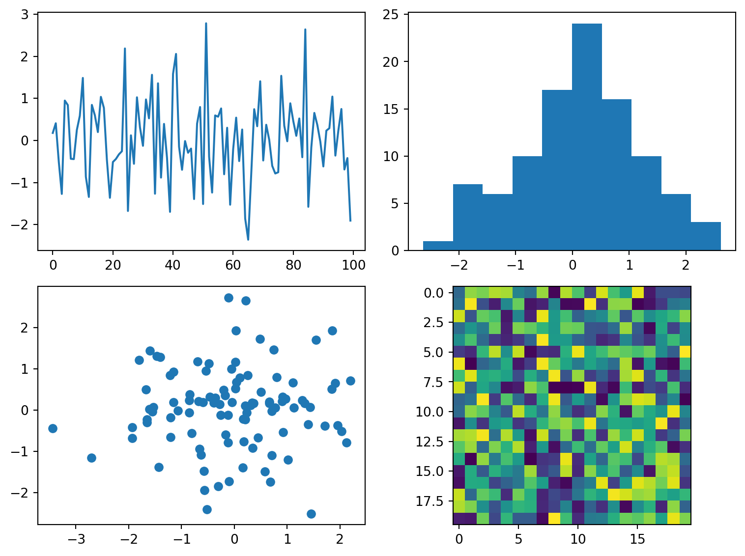
This creates a 2x2 grid of subplots, each with a different type of plot. tight_layout() helps prevent overlapping elements.
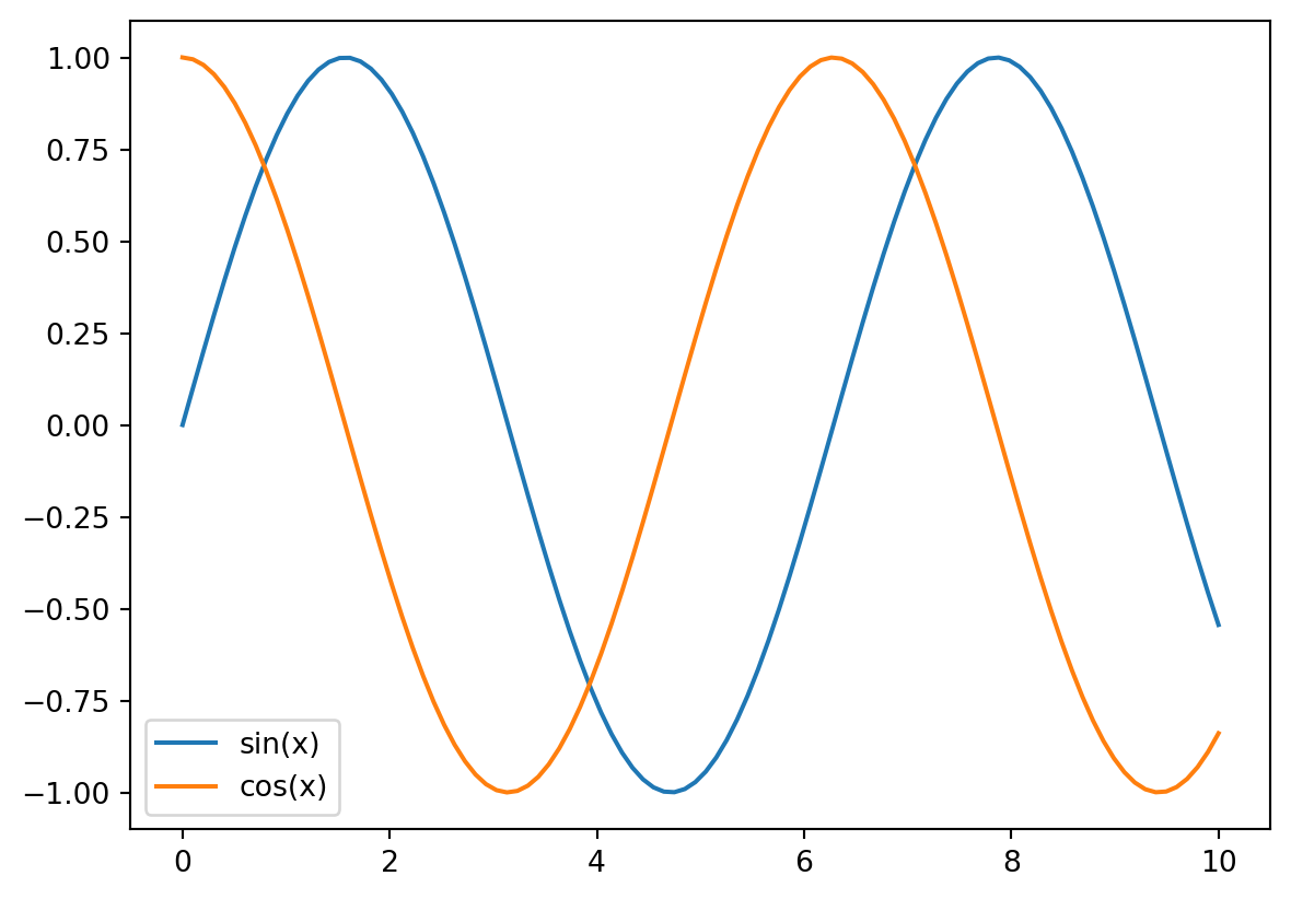
Titles, axis labels, and legends are essential for clear and informative plots. These are added using the following functions:
title(): Sets the title of the plot.xlabel() and ylabel(): Set the labels for the x and y axes.legend(): Adds a legend to the plot. The label argument within plotting functions (e.g., plot(), scatter()) assigns labels to the plotted elements.import matplotlib.pyplot as plt
import numpy as np
x = np.linspace(0, 10, 100)
y1 = np.sin(x)
y2 = np.cos(x)
plt.plot(x, y1, label='sin(x)')
plt.plot(x, y2, label='cos(x)')
plt.xlabel("x values")
plt.ylabel("Function Values")
plt.title("Sine and Cosine Waves")
plt.legend()
plt.show()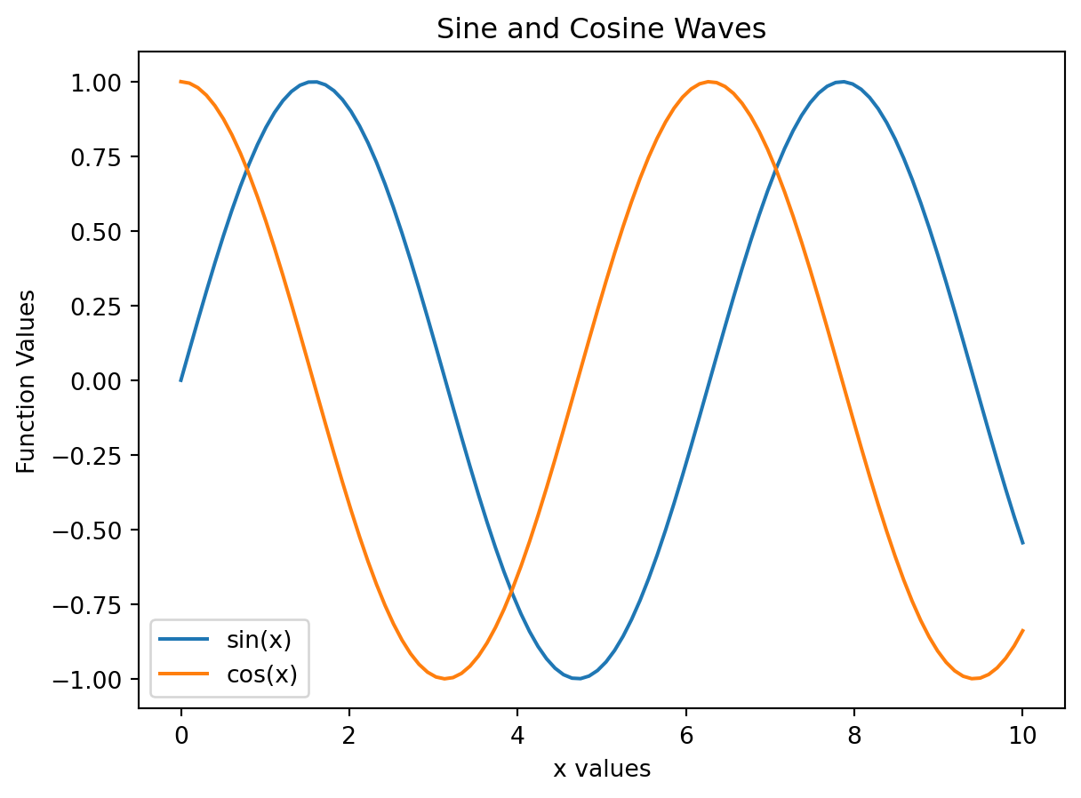
For more control over legend placement, refer to the legend() function’s documentation.
Control axis ranges and tick marks using these functions:
xlim() and ylim(): Set the limits of the x and y axes.xticks() and yticks(): Set the tick locations and labels on the axes.import matplotlib.pyplot as plt
import numpy as np
x = np.linspace(0, 10, 100)
y = np.sin(x)
plt.plot(x, y)
plt.xlim(0, 5) # Set x-axis limits
plt.ylim(-1.2, 1.2) # Set y-axis limits
plt.xticks([0, 2, 4, 5]) #customize x ticks
plt.yticks([-1, 0, 1]) #customize y ticks
plt.show()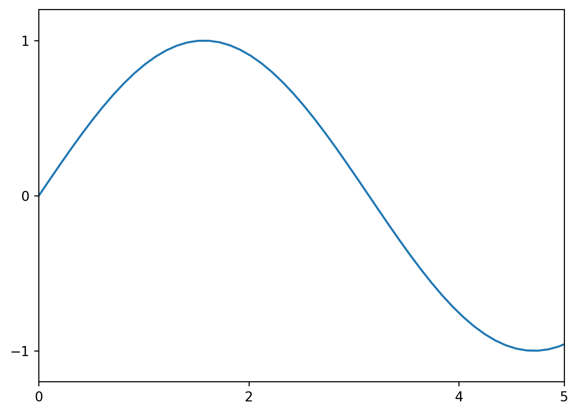
You can also use xticks and yticks to set custom labels at the specified tick positions.
Customize the appearance of lines and markers using arguments within plotting functions:
color: Specifies the color (e.g., ‘red’, ‘blue’, ‘green’, or hex codes).marker: Specifies the marker style (e.g., ‘o’, ‘s’, ‘^’, ‘x’).linestyle: Specifies the line style (e.g., ‘-’, ‘–’, ‘:’, ‘-.’).import matplotlib.pyplot as plt
import numpy as np
x = np.linspace(0, 10, 10)
y = x**2
plt.plot(x, y, color='purple', marker='o', linestyle='--', markersize=10, linewidth=2)
plt.show()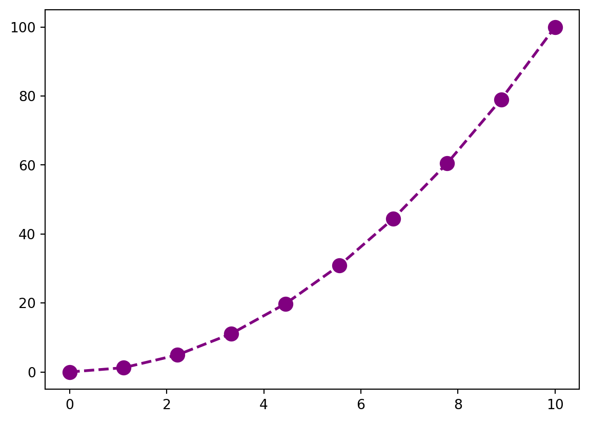
Add annotations and text to plots using:
annotate(): Adds an annotation with an arrow to a specific point.text(): Adds text to a specified location.import matplotlib.pyplot as plt
import numpy as np
x = np.linspace(0, 10, 100)
y = np.sin(x)
plt.plot(x, y)
plt.annotate('Maximum', xy=(np.pi/2, 1), xytext=(4, 0.8), arrowprops=dict(facecolor='black', shrink=0.05))
plt.text(2, 0.5, "Some Text", fontsize=12)
plt.show()
Matplotlib offers extensive text formatting options using the text() function and matplotlib.text.Text properties. You can control font size, style, weight, color, and alignment. See the documentation for a complete list of options.
Control the thickness and style of lines and text size and style using the following arguments (often within plotting functions or text()):
linewidth or lw: Sets the line width.fontsize or fs: Sets the font size.fontweight: Sets the font weight (e.g., ‘bold’, ‘normal’).fontstyle: Sets the font style (e.g., ‘italic’, ‘normal’).Colormaps assign colors to data values, especially useful for visualizing data in images or 3D plots. Use the cmap argument in functions like imshow() and plot_surface(). Matplotlib provides many built-in colormaps (e.g., ‘viridis’, ‘plasma’, ‘magma’, ‘inferno’, ‘cividis’).
import matplotlib.pyplot as plt
import numpy as np

data = np.random.rand(10, 10)
plt.imshow(data, cmap='viridis')
plt.colorbar()
plt.show()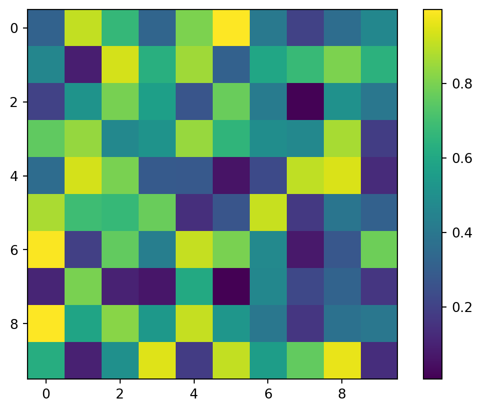
Overall plot appearance can be adjusted using stylesheets (e.g., plt.style.use('ggplot'), plt.style.use('seaborn-whitegrid')). These stylesheets predefine settings for fonts, colors, and plot elements. You can also customize individual elements as shown in the previous sections for more fine-grained control. See the Matplotlib style sheets documentation for available options.
Matplotlib’s plotting functions primarily work with NumPy arrays. Data is typically organized into arrays representing x and y coordinates or other relevant dimensions.
import matplotlib.pyplot as plt
import numpy as np

# Sample data as NumPy arrays
x = np.array([1, 2, 3, 4, 5])
y = np.array([2, 4, 1, 3, 5])

# Create the plot
plt.plot(x, y, marker='o', linestyle='-')
plt.xlabel("X-axis")
plt.ylabel("Y-axis")
plt.title("Plot from NumPy Arrays")
plt.show()

#Example with multiple lines
x = np.linspace(0, 10, 100)
y1 = np.sin(x)
y2 = np.cos(x)

plt.plot(x, y1, label='sin(x)')
plt.plot(x, y2, label='cos(x)')
plt.legend()
plt.show()
For multi-dimensional data, you might need to reshape or slice your arrays appropriately before plotting.
Pandas DataFrames provide a convenient way to handle structured data. Matplotlib integrates seamlessly with Pandas; you can directly plot columns of a DataFrame.
import matplotlib.pyplot as plt
import pandas as pd
import numpy as np
# Sample data in a Pandas DataFrame
data = {'X': np.arange(5), 'Y1': np.random.rand(5), 'Y2': np.random.rand(5)}
df = pd.DataFrame(data)
# Plotting directly from the DataFrame
df.plot(x='X', y=['Y1', 'Y2'], kind='line', marker='o') # 'kind' specifies the plot type
plt.xlabel("X-axis")
plt.ylabel("Y-axis")
plt.title("Plot from Pandas DataFrame")
plt.show()
#Scatter plot example
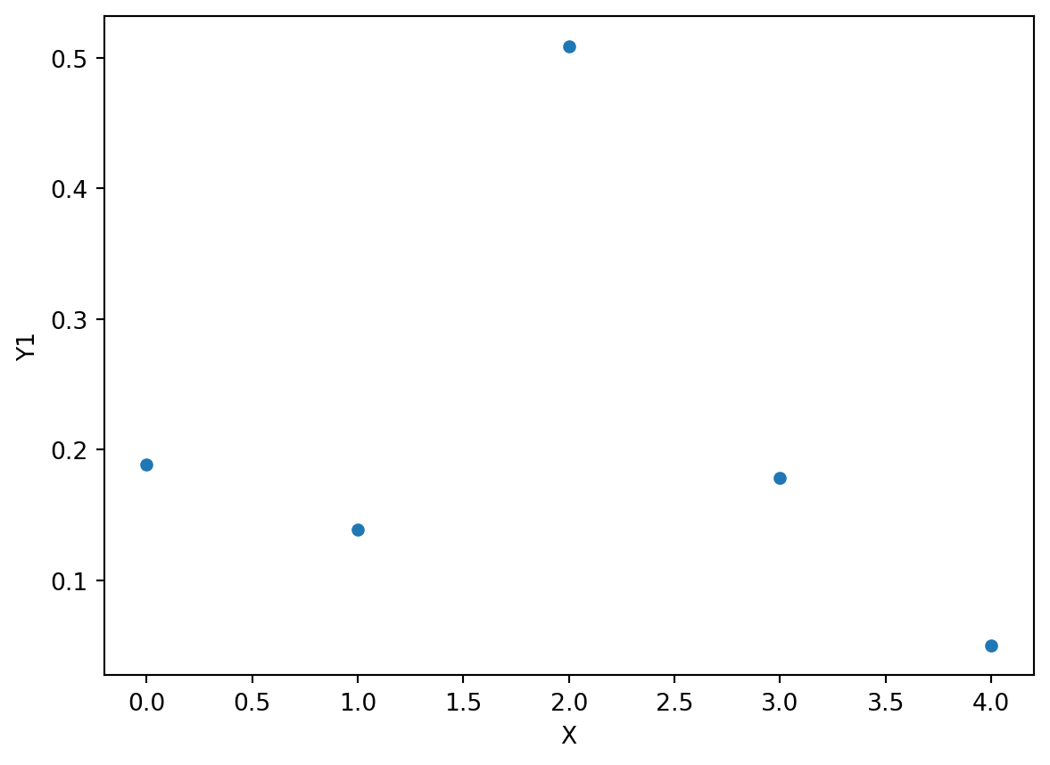
df.plot.scatter(x='X', y='Y1')
plt.show()
#Bar chart example
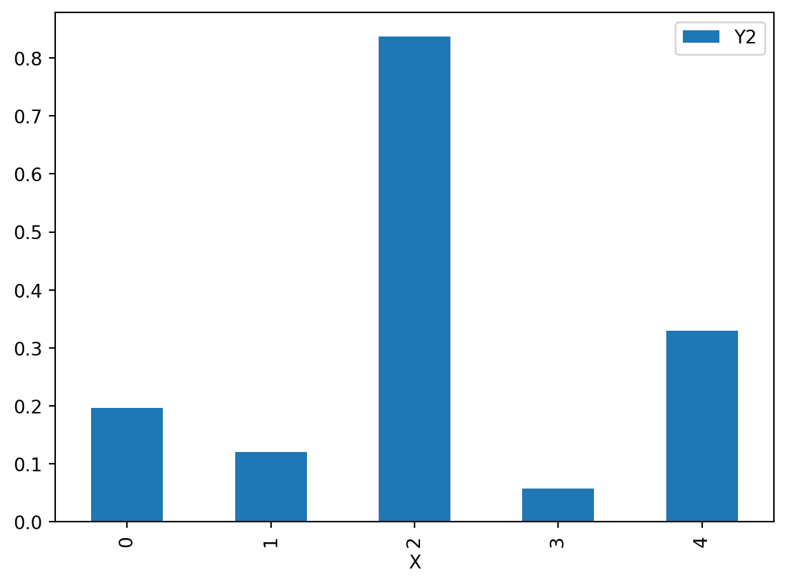
df.plot.bar(x='X', y='Y2')
plt.show()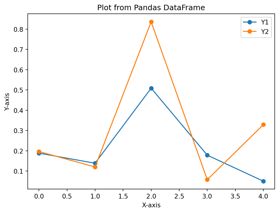
Pandas’ plotting functionality offers various plot types (‘line’, ‘bar’, ‘scatter’, ‘hist’, etc.) directly accessible through the .plot() method.
While NumPy arrays and Pandas DataFrames are the most common data structures used with Matplotlib, you can adapt your data to these formats for plotting. For example, you can convert lists or tuples into NumPy arrays using np.array(). Dictionaries can be converted to Pandas DataFrames using pd.DataFrame().
Often, you need to transform your data before plotting to improve visualization or highlight specific aspects. Common transformations include:
Scaling: Scaling data to a specific range (e.g., using MinMaxScaler from scikit-learn) to emphasize certain features or ensure consistent scales across different datasets.
Normalization: Normalizing data (e.g., z-score normalization) to have a mean of 0 and a standard deviation of 1.
Logarithmic Transformations: Applying logarithmic transformations (e.g., np.log() or np.log10()) to compress the range of data with wide variations. Useful for data with skewed distributions.
Smoothing: Applying smoothing techniques (e.g., moving average) to reduce noise and highlight underlying trends. SciPy provides functions for smoothing.
Filtering: Removing outliers or irrelevant data points before plotting.
import matplotlib.pyplot as plt
import numpy as np
from scipy.ndimage import gaussian_filter1d #for smoothing

# Example: Smoothing noisy data
x = np.linspace(0, 10, 100)
y_noisy = np.sin(x) + np.random.normal(0, 0.5, 100)  # Noisy sine wave
y_smoothed = gaussian_filter1d(y_noisy, sigma=2) #smooth using gaussian filter

plt.plot(x, y_noisy, label='Noisy Data')
plt.plot(x, y_smoothed, label='Smoothed Data')
plt.legend()
plt.show()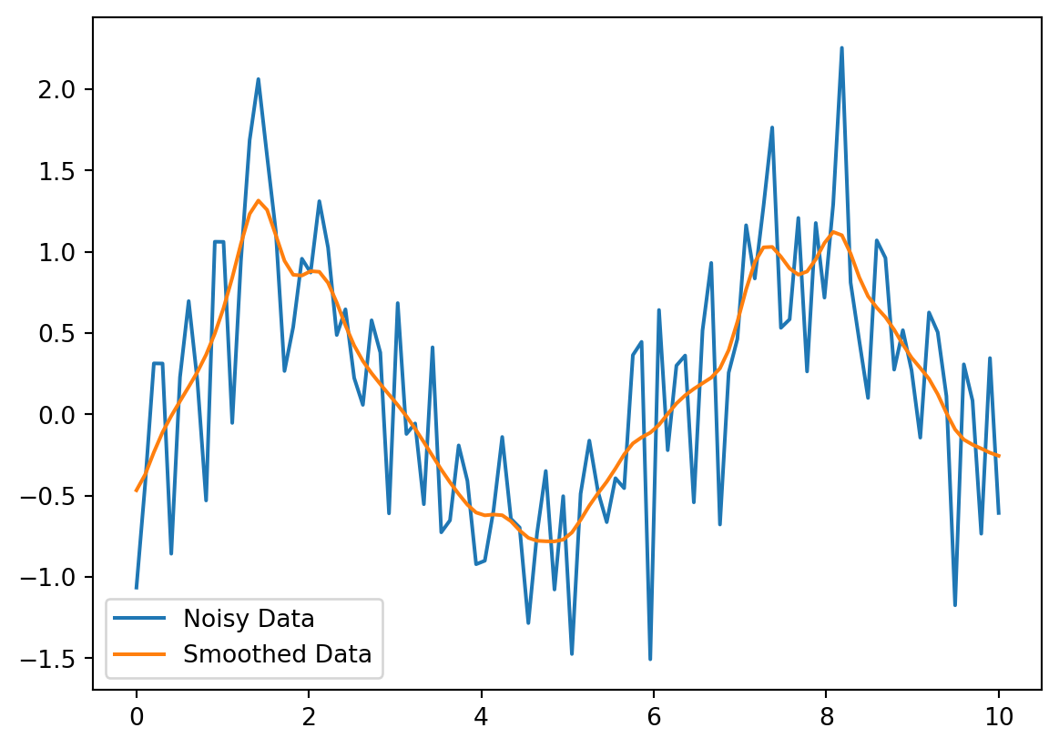
Remember to choose appropriate transformations based on the nature of your data and the insights you want to convey in the visualization.
Matplotlib’s animation capabilities allow you to create dynamic visualizations. The matplotlib.animation module provides tools for generating animations. Typically, you create a function that updates the plot’s data at each frame, and then use FuncAnimation to create the animation.
import matplotlib.pyplot as plt
import numpy as np
import matplotlib.animation as animation

fig, ax = plt.subplots()

x = np.arange(0, 2*np.pi, 0.1)
line, = ax.plot(x, np.sin(x))

def animate(i):
    line.set_ydata(np.sin(x + i/10.0))  # update the data
    return line,

ani = animation.FuncAnimation(fig, animate, np.arange(1, 200), interval=25, blit=True)
plt.show()
This creates an animation of a sine wave shifting to the left. blit=True improves animation speed. Saving animations often requires additional libraries like ffmpeg. Consult the matplotlib.animation documentation for more details.
While Matplotlib primarily creates static plots, some level of interactivity is possible. For example, you can use matplotlib.widgets to add interactive elements like sliders, buttons, and text boxes to your plots. For more advanced interactive visualizations, consider libraries like Bokeh or Plotly, which are built for interactive web-based plots.
import matplotlib.pyplot as plt
import numpy as np
from matplotlib.widgets import Slider

fig, ax = plt.subplots()
plt.subplots_adjust(bottom=0.25) #make room for slider

x = np.arange(0, 10, 0.1)
y = np.sin(x)
line, = ax.plot(x, y)

axfreq = plt.axes([0.25, 0.1, 0.65, 0.03]) #define slider position
freq_slider = Slider(axfreq, 'Freq', 0.1, 30.0, valinit=1.0)

def update(val):
    amp = freq_slider.val
    line.set_ydata(np.sin(x * amp))
    fig.canvas.draw_idle()

freq_slider.on_changed(update)
plt.show()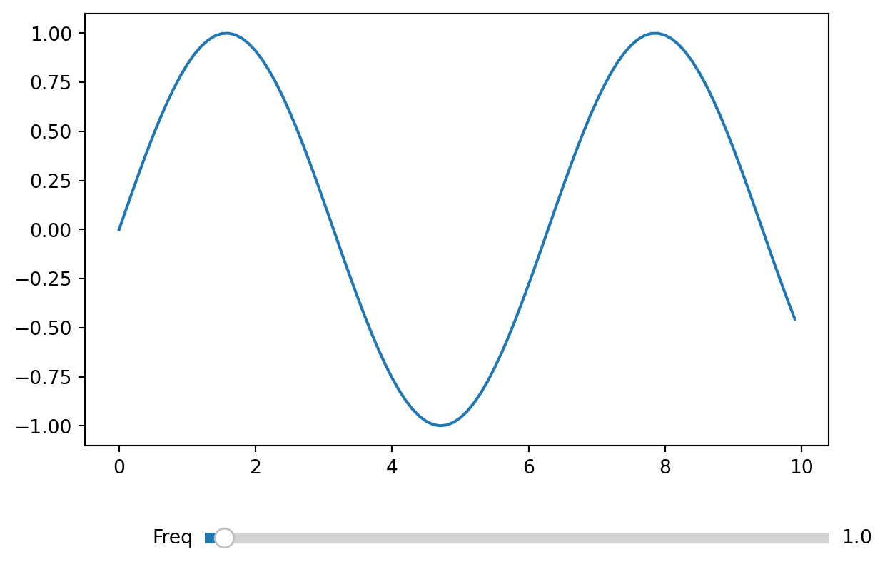
This example demonstrates a slider that changes the frequency of a sine wave.
Beyond the basic customization options, Matplotlib allows for extensive control over individual plot elements. You can directly manipulate properties of artists (lines, text, etc.) to achieve highly customized visuals. Refer to the Matplotlib documentation for details on artist properties and methods. For example you can access and modify properties of individual lines using the .set_* methods (like .set_linewidth(), .set_color(), etc.)
Control the arrangement of multiple subplots using plt.subplots() or plt.GridSpec(). GridSpec provides more flexible control over subplot placement. tight_layout() automatically adjusts subplot parameters to provide a better layout, preventing overlap.
Save plots to various file formats using savefig().
import matplotlib.pyplot as plt
import numpy as np

x = np.linspace(0, 10, 100)
y = np.sin(x)
plt.plot(x, y)
plt.savefig("my_plot.png", dpi=300) #dpi controls resolution
plt.savefig("my_plot.pdf")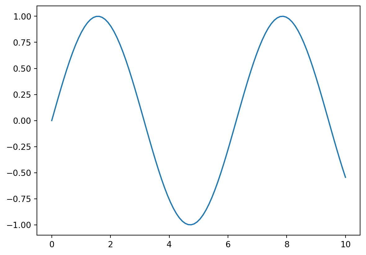
Supported formats include PNG, JPG, PDF, SVG, and more. The dpi argument controls the resolution of raster formats (PNG, JPG).
Create multiple figures using plt.figure(). Each call to plt.figure() creates a new figure, allowing you to manage multiple plots independently.
Matplotlib works well with other scientific Python libraries like NumPy, Pandas, SciPy, and Seaborn. Seaborn, in particular, builds on top of Matplotlib to provide statistically informative plots with an aesthetically pleasing default style.
Common issues include:
plt.tight_layout() to adjust spacing.xlim() and ylim().plt.style.use('default') to reset to default style.pip install matplotlib). Consider using a virtual environment for better dependency management.The official Matplotlib documentation is the most comprehensive and authoritative source of information. It includes detailed explanations of all functions, classes, and modules, along with numerous examples and tutorials. The documentation is well-organized and searchable, making it easy to find specific information. You can access it at https://matplotlib.org/stable/contents.html (or the latest version’s URL). The documentation also contains a comprehensive API reference, a gallery of example plots, and tutorials for users of different skill levels.
A vibrant community surrounds Matplotlib, providing various avenues for support and collaboration. The Matplotlib community is active on several platforms:
Matplotlib’s Mailing List: A mailing list where users can ask questions, share solutions, and discuss Matplotlib-related topics. Instructions for subscribing are usually available on the official website.
Stack Overflow: A popular question-and-answer site where many Matplotlib-related questions are answered. Search for Matplotlib-specific questions or post your own, making sure to include relevant code snippets and error messages.
GitHub Issues: The Matplotlib project is hosted on GitHub, where users can report bugs, request features, and participate in discussions. Check for existing issues related to your problem before creating a new one.
Online Forums: Various online forums and communities dedicated to Python programming or data visualization often have threads dedicated to Matplotlib.
The Matplotlib example galleries showcase a wide range of plots and visualization techniques. These examples provide practical demonstrations of how to create different types of plots and customize their appearance. The galleries are a great resource for learning new plotting techniques and finding inspiration for your own projects. They are typically integrated into the official documentation website. Browsing the galleries is a very effective way to discover the breadth of Matplotlib’s capabilities.
Beyond the basic tutorials, several resources provide guidance on more advanced Matplotlib techniques. These advanced tutorials may cover topics such as:
Customizing plot elements in detail: Advanced techniques for controlling plot aesthetics, including creating custom styles and using object-oriented approaches.
Creating interactive plots: Techniques for building interactive visualizations using Matplotlib’s widgets or integrating Matplotlib with JavaScript libraries.
Generating animations: Advanced methods for creating smooth and efficient animations, including optimizing performance for large datasets.
Working with large datasets: Strategies for efficiently handling and visualizing large amounts of data without compromising performance.
Integrating Matplotlib into applications: Techniques for embedding Matplotlib plots within larger applications or web frameworks.
Many online resources, including blog posts, articles, and video tutorials, delve into these advanced topics. Searching for “advanced Matplotlib tutorials” or specific advanced features you are interested in will yield numerous results. Furthermore, the official Matplotlib documentation often has links to or mentions relevant advanced examples.